I was also able to use Google to research different film production company logos which was able to help me make a decision on my final production company logo.
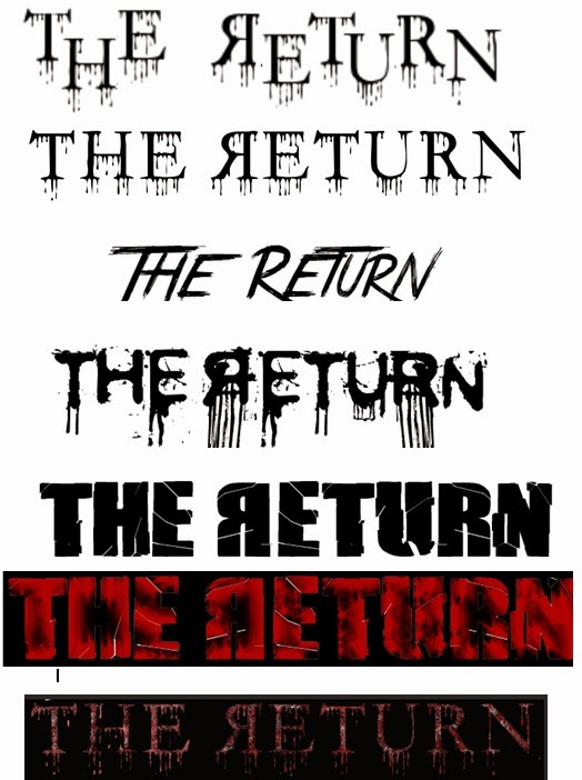
Using dafont, I was able to use my knowledge from researching existing typographies and create my own. I then had inserted these typograhpies into photoshop, were I was able to change the colours and sizes, and therefore led to me creating a variety of typographies
In the end, we had come to a group decision and decided on the following typography. We decided on this typography as we felt it contained all 3 colours that convey the horror slasher genre, and it also reinforces gore, and danger due to the dripping blood effect. We also reflected the letter 'R' for Return as this represents the narrative, as the character Ruby is 'returning' from the dead, and therefore is coming back, rather than going away. A further reason why we decided to use this typography was due to the fact the design was made to look like ripped flesh by using both colours red and white to create this look, with dripping bits of blood which reinforces a horror genre.


No comments:
Post a Comment